Follow the instructions below to create Corporate Charts (CC). The guide can be applied to all types of charts, the column chart will be an example.
Add CC to the SDUP
1) In Plugins get the latest CorporateCharts plugin from SD.Installers
2) In Modules get the latest CorporateCharts module from SD.Installers
3) In Content create an empty folder named CorporateCharts
CC builder
When designing the charts you will need to use a builder in Excel to create different charts.
Locate the Corporate Chart builder using OmniTools.
In the builder, we are able to create the charts listed in the tabs.

1) Delete the tabs you don't need, only the relevant should be left in the sheet.
2) The builder should be saved in SharePoint.
Extremely important! Always apply the design to the chart in Excel using the built-in functions! E.g. do not center the title by manually dragging the title! Charts are built by settings in Excel and manually applied design will not be included.
Color theme
In the first tab named "Søjler" you can add the name of the Color theme, usually, the name of the client, if only one theme is used.
If more themes are required, create more tabs with the different design and name the tabs, e.g. column chart blue, column chart red, etc.
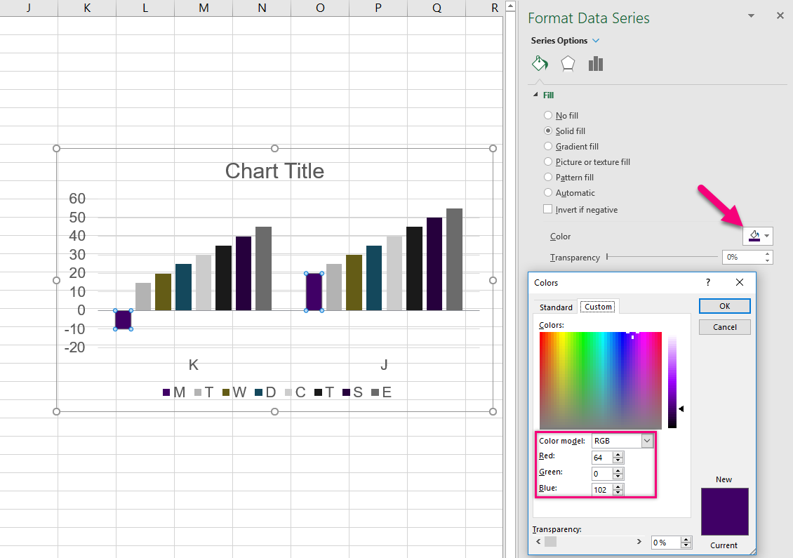
To apply the color theme
1) Click the column.
2) Change the colors for each column using the Format Data Series menu in Excel.
Font
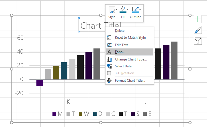
To adjust the font:
1) Right-click the border of the chart and click Font.
2) Adjust all settings regarding the font, including style, color, effects.
3) Finish by setting the Chart Title font separately, if different from the overall font used.
Gridlines
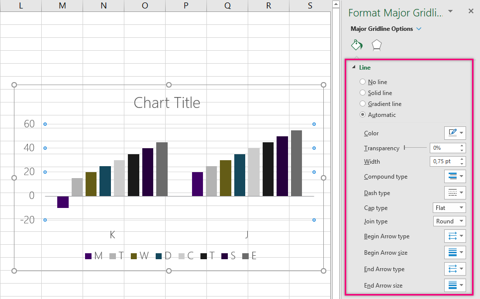
To apply color and design to the gridlines:
1) Select the gridlines
2) Use the Format Major Gridlines in Excel to change the color and type if needed.
Axis, legends, titles
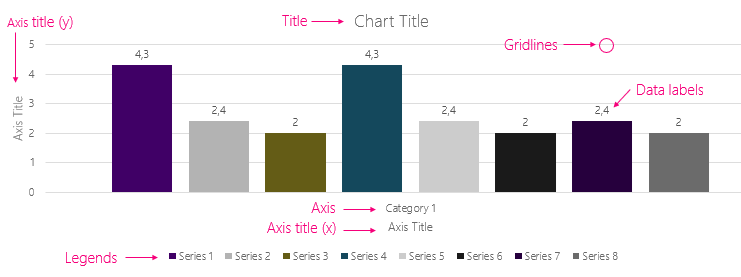
To adjust the placement of the axis, legends, and titles:
1) Click the chart
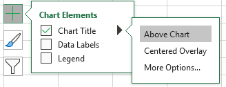
2) Use the 'plus' to add/remove the Chart Title, Data Labels, and Legends. Use the arrow > to adjust the position.
Pie/doughnut chart
When designing pie/doughnut charts, remember to:
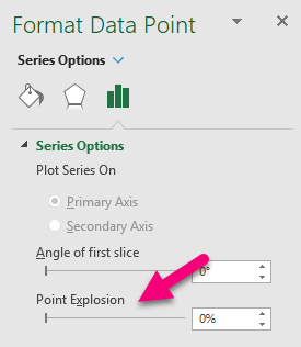
1) Adjust the Explosion option (space between slice and center) using the Format Data Point.
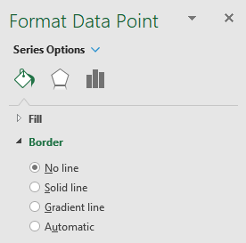
2) Add/remove line from a slice.
Convert Chart into Template
When you are done designing the chart, you must save the chart as a Template.
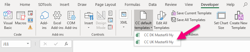
Open the Developer tab, and locate this menu:
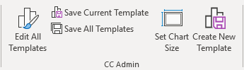
1) Click 'Create New Template'
2) You will now see this form which should be adjusted:
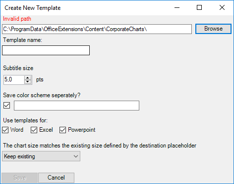
Path: Add a path, If you keep the path to the C:\ you can test in your local environment, otherwise point this to the client's SDUP folder (Content).
Template name: Fill in the name you want the template to be called in the client's ribbon.
Subtitle size: Should not be changed.
Save color scheme separately: Here you add the name of the color scheme for your client. Only do this when creating the Column/Søjle chart (this will work in both Word and PowerPoint). If you need more color schemes, save the schemes separately on the other charts. If only the color scheme is needed and not the chart, list the Office programs in the .xml file to 'false', after it has been saved.
Use template for: Choose more than one if the design is exactly the same. If not, you will have to adjust them in separate tabs in the builder e.g. Column chart Word, Column Chart PP.
Chart size: Should not be changed.
3) Now you want to add data files, which is needed if the client would like to display a chart with 8 colors.
In the Content folder, the charts are listed as below:
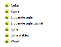
The name of the folder, is the name of the button in the ribbon. However, if you wish a chart to have another name than the folder, you can in the config.xml file define AlternativeName to the desired name. To make the alternative name show in ribbon, insert special="CorporateCharts:AlternativeName" in your module, when defining a button. See the example below:
<Button special="CorporateCharts:AlternativeNamePP" icon="ChartStylesGallery" dependency1="CorporateCharts" showInWord="false" showInExcel="false">
     <Cmd case="CorporateCharts:create_apply" input="@templ"/>
</Button>

In config.xml
AlternativeNamePP=Cirkel
Within the folders, data.xml file must be created named data.xml.
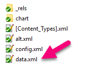
The structure below should be used for pie/doughnut charts. The years in the example below are the legends, and the numbers are the values of the slice. Copy the structure in the file and adjust them.
  ;Chart Title

  2009;3

  2010;4

  2011;4
Other charts can use this file below:
  ;Series 1;Series 2;Series 3;Series 4;Series 5;Series 6;Series 7;Series 8

  2015;1;3;2;3;4;3;2;3

  2016;2;5;4;2;2;5;4;2

  2017;3;5;1;4;3;5;1;4

  2018;4;5;2;5;4;5;2;5
When the data files are added, the chart will open up with defined legends (years in the example) colors, and the number of columns you have added in the file.
4) The chart and the color theme will now be visible in the ribbon here:

Was this article helpful?
That’s Great!
Thank you for your feedback
Sorry! We couldn't be helpful
Thank you for your feedback
Feedback sent
We appreciate your effort and will try to fix the article