We save the configuration of the infographics in the Content folder within the client's SDUP. The configuration is separated into colors, icons and templates, which are all saved as json files.

In order to configure the templates, use the admin editor, which is a task pane that allows to create new templates, customize the settings of each template as well as to uploade colors and icons.
The following command activate and opens the admin task pane:
<Cmd case="InfoGraphics:Launch"/>
This is already present in OmniTools (in the Developer tab).
Admin pane for configuration
Expand the task pane in order to see the different options (Templates, Colors and Icons). In the tab called "Templates", you can create a new template or click an existing to change the settings. In the "Color" tab, new colors can be added, while the "Icons" tab enables to upload and name new icons.
The configuration of both templates, colors and icons will automatically be saved in their respective folders in this path:
%programdata%\OfficeExtensions\Content\InfoGraphics\data
For this reason, go to File Explorer and type %programdata% and find the content concerned. Make sure to copy the InfoGraphics folder from this path and then paste it into the Content folder in the client's SDUP.
The following sections elaborate on how to configure the elements for infographics using the admin pane. We start with colors and icons as these will be present in the settings for templates.
Configuration of colors
The following image illustrates the color tab. The four elements are described below.
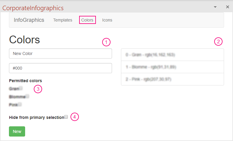
1) Add new color
When adding a new color, we must define the name of particular color in the "New Color" field and the color code in the second field. The color can be specified in either HEX or RGB. If using HEX, define the color code with the # in front of the numbers/letters (as default in the field). If using RGB, the color must be specified like this: rgb(0,0,0). Finish by clicking the "New" button.
2) Added colors
The added colors will be present at the right side of the pane.
3) Permitted colors
When clicking an added color, it is possible to select which of all the colors that should be permitted for this particular color. This means that we can specify which colors are permitted as secondary color when a specific color is selected as primary color.
4) Hide from primary selection
When clicking an added color, we can specify whether this particular color should be hidden in the primary selection and thus only be available as a secondary color.
Configuration of icons
All icons should be uploaded as SVG files. The following image illustrates the icon tab.
1) Add new icon
Make sure to open the SVG file at your computer with Notepad++ and then copy the entire content. Define the name of the particular icon in the first field and then paste the content from the SVG file in the second field.
2) Added icons
The added icons will be present in their SVG code at the right side of the pane.
Configuration of templates
The image below illustrates the template tab. From, here there are two options: 1) existing templates are shown and can be clicked in order to change their settings, and 2) new template can be added.

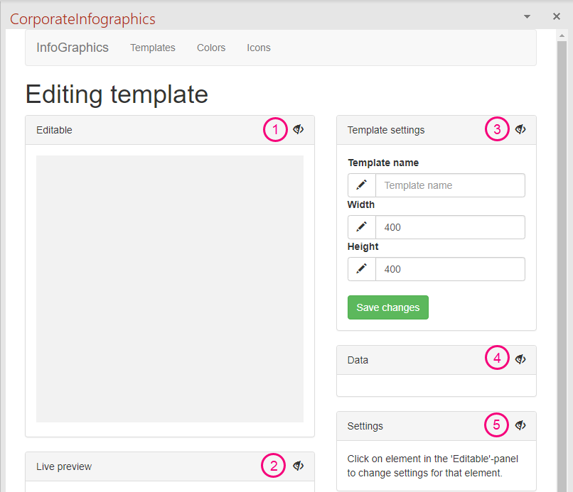
When clicking an existing template or "Add new template", the pane will open the editor view where the settings can be adjusted. The following image shows this view. Notice that it is empty when clicking "Add new template". If an existing template is selected, it will show the template in preview as well as its particular settings.
Each of the boxes can be shown/hidden by clicking at the eye.
1) Editable
The idea when configuring an infographic is that an element in the editable pane must be clicked and then the settings (5) will expand with various options. This can, for example, be text or a chart within the infographic. When editing a new template, just click the grey square to add elements.
2) Live preview
This is a preview of the infographic.
3) Template settings
Define the name of the template as well as the width and height in pixels. It is important to click "Save changes" when changes in the settings have been made.
4) Data
This box will be empty until elements are added to the infographic. Once elements, e.g. text and charts, are added, the configured icons and colors will appear and can then be selected for the particular element. Furthermore, when you add elements to the infographic that requires some data (e.g. a people chart), it will be in this box you can define both number part and number total as well.
5) Settings
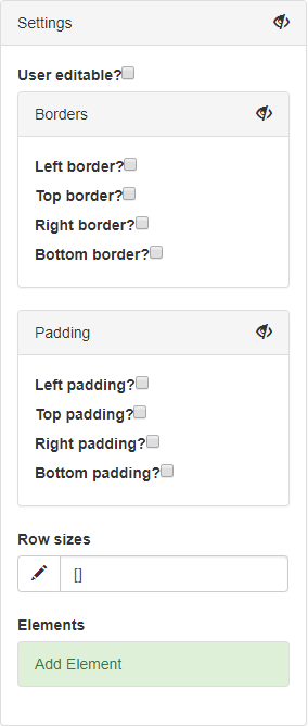
Select an element in the editable panel in order to see available settings for the element. If there are no elements yet, click the grey square in the editable panel and then click "Add Element":
We support the following elements:
- Column
- Row
- Text
- People chart
- Icon percentage
- Pie percentage
- Plain icon
- Percentage indicator
- Icon size chart
Borders and padding
For each element we are able to add both borders and padding. When checking off a border, it is moreover possible to define the border color (from the configured colors) and border width (in pixels). When padding is added, it must be defined in pixels as well.
Row size
Each element in the infographic is row. For instance, if the infographic consist of a heading (text), a chart and then a source (text), the infographic has three rows. We can then specify the size of each row in pixels separated by a comma. Here is an example: [67,98.2,60.4].
Note that it is important that the total height of the infographic reflects row sizes and padding.
Text settings
Select a text element in the infographic to see the text settings. Here, you are able to define the label of the text field that will be present in the user view of CorporateInfographics as well as the default insertion text in this very field. You can use the following references to refer to data variables:
@NumberPart refers to the numerator.
@NumberTotal refers to the denominator. Commonly, these two will be used in conjunction: @NumberPart/@NumberTotal.
@NumberPercentage Refers to a percentage and will commonly be followed by a %-symbol.
Furthermore, we support defining the font for the particular text element as well as adjusting font size, letter spacing, font weight, horizontal and vertical alignment and text color. The font weight defines how bold the text should be and this property takes a numerical value. The following is a rough guide:
200 = Light
400 = Regular/normal
700 = Bold
900 = Heavy
Icon settings
Select an element that includes icons to see the icon settings.
We support using opacity for the remaining icons in a chart. For instance, if the infographic is a "X of 10" infographic and the number part is set to 7, the remaining three icons in the infographic will have a transparency layer. We can then define the opacity of this layer.
We also support horizontal and vertical padding of the icon. This must be defined in pixels.
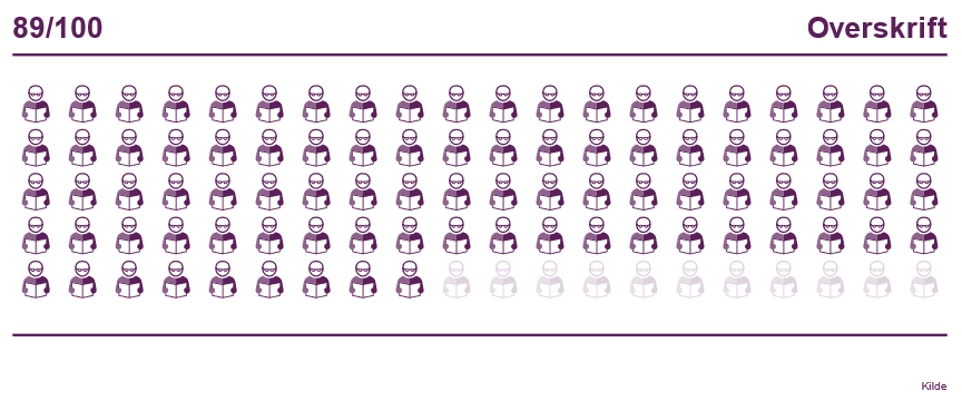
Finally, we are able to define how many rows or columns the icons should be placed in. For instance, if it is a "X of 100" infographic, we can define the number of rows or columns. The following infographic is an example from Lærernes Pension which is configured to have 20 columns:
Specify font for the infographic
We are able to specify the overall default font for the infographic. However, this is not supported in the editor. To change the default font, go to the template (the json) in the Content folder and add a property called defaultFontName in the "first layer" of the json. Here is an example:
{
  "width": 882,
  "height": 360,
  "defaultFontName": "Times New Roman",
  "root": {
    ....
  }
}
Comments
0 comments
Article is closed for comments.