With Alloy, we are able to create overlay buttons in both Word, PowerPoint and Excel. Thus, this is a tool when working with inserted shapes. This article will elaborate how the overlay feature works. For instance, we can edit an infographic inserted with CorporateInfographics or change the color of a simple shape.
Overlay buttons require Alloy version 13.0.0 or later.
First, you must create a new folder in your Modules folder called overlay_shapes. In this folder, your module should be located. Thus, the path should look like this:
...\OfficeExtensions\Modules\overlay_shapes\moduleName.xml
Icons of overlay buttons
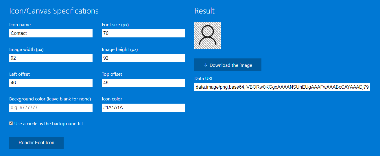
Icons of overlay buttons can be set as a RGB color or with a customized icon. Icons can be customized using this link which is a tool to render an icon from the Office Fabric UI icons. Here, you can select an icon and specify the size and color of it.
In the first field, you must specify the name of the icon. All icons and their names can be seen here. Just hover an icon, and the name will appear.
Rules when customizing icons
To ensure that we customize our icons correctly and standardized, there are a few rules to follow:
- Font size must be 70
- Both image height and width must be 92
- Both left and top offset must be 46
- Icon color must be #1A1A1A
- Leave the background color blank to allow a hover effect (created by Alloy)
Saving and using the icon
After downloading the icon, locate it in the folder called Icons inside the folder of the plugin concerned. As an example, if this is the path for the icon:
...\Plugins\InfoGraphics\Icons\CodeEdit.png
Thus, the icon must be written like this in the module:
icon="InfoGraphics:CodeEdit.png"
Visibility of overlay buttons
We are able to perform a visibility filtering on overlay buttons. This ensures that we can control the visibility of an overlay button to be shown or hidden based on what is defined.
We use the same feature and syntax as when controlling the visibility in ribbon. Thus, we can control the visibility of an overlay button with the same elements as in the ribbon. See the list of supported elements here.
As an example of usage, we can control the visibility of the overlay buttons in the agenda feature to only be visible if a slide with a specific custom layout is in the slide deck. The agenda feature requires a custom layout called "Agenda layout" to be present, and thus we can define that the overlay buttons should first appear when the agenda slide (which has the agenda layout) is inserted in the slide deck.
Overlay buttons on shapes
We can control the visibility of overlay buttons on shapes by filtering using the shape name or alt text of the shape.
Supported types
We support the following types.
SelectedShapeName
Matches on the shape name.
!SelectedShapeName
Does also match on the shape name, but inverse.
SelectedShapeAltText
Matches on alt text of shape.
!SelectedShapeAltText
Does also match on alt text of shape, but inverse.
Supported keys
The key is used to define what kind of operation is performed. We support the following.
equals
Compares the shape name or alt text with the value.
contains
Checks whether the shape name or alt text contains the value.
Examples
The example below will show the overlay button if the selected shape name is test.
  visible="BaseExtensions:any" visible-1-type="SelectedShapeName" visible-1-key="equals"
  visible-1-value="test"
The example below will show the overlay button if the alt text of the shape does not contain hello.
  visible="BaseExtensions:any" visible-1-type="!SelectedShapeAltText" visible-1-key="contains"
  visible-1-value="hello"
Example of usage: Editing an infographic
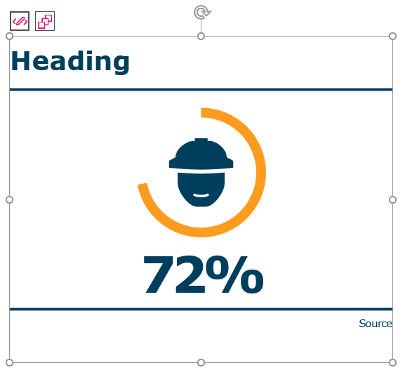
In this example, the overlay buttons are used at an infographic inserted with CorporateInfographics. In this way, the user can quickly and easily edit the inserted infographic or open the view of other templates, and thus replace the inserted one with another template.
<Button visible="InfoGraphics:IsInfoGraph" icon="InfoGraphics:CodeEdit.png">
   <Cmd case="InfoGraphics:Activate"/>
</Button>
<Button visible="InfoGraphics:IsInfoGraph" icon="InfoGraphics:BuildQueue.png">
   <Cmd case="InfoGraphics:Templates"/>
</Button>
<Button visible="InfoGraphics:IsPlaceholder" icon="InfoGraphics:BuildQueue.png" label="Insert InfoGraphic">
   <Cmd case="InfoGraphics:Activate"/>
</Button>
This is how the overlay buttons appear:
Example of usage: Changing color of a shape
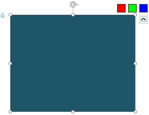
This is an example of how overlay buttons can be used to change fill color of the selected shape. In this case, the icons of the buttons are specified using RGB colors.
<Button label="red" icon="rgb:255.0.0">
  <Cmd case="BaseExtensions:change-fill-color" color="255,0,0"/>
</Button>

<Button label="green" icon="rgb:0.255.0">
  <Cmd case="BaseExtensions:change-fill-color" color="0,255,0"/>
</Button>

<Button label="blue" icon="rgb:0.0.255">
  <Cmd case="BaseExtensions:change-fill-color" color="0,0,255"/>
</Button>
These three buttons will appear as an overlay to selected shape:
Was this article helpful?
That’s Great!
Thank you for your feedback
Sorry! We couldn't be helpful
Thank you for your feedback
Feedback sent
We appreciate your effort and will try to fix the article